Tuesday, 19 January 2016

Sunday, 3 January 2016
Task 11: Film Review Practice 1
To do a draft of the two page spread film review, I worked in Photoshop. I set the canvas at 50cm (width) and 30cm (height) as a rough guideline of the shape the final print product will be. The black line in the middle of the canvas is to indicate the split between the two pages.
 I then took a screen grab from the first edit and made it larger so it covered the majority of the second page. After doing research into film reviews in well-known magazines, such as Empire, I found that there was little blank space on either page, with one page almost completely covered in an image or several images.
 Finding a font was difficult as it needed to look realistic. I looked at Empire film reviews to compare what fonts are used for the titles. The closest I could find on Photoshop was Ariel Black as, even though it is simple, it is clear and bold. I also noticed that the text that overlaps images blend into the white background as there is a white border around the text. To do this, I simply placed the text over a white rectangle which I created by using the rectangle tool.


 I then wanted to add in some sort of rating. To do this, I searched for how Empire do their star ratings and found an image of their single star symbol. I experimented with adding a white border around the four stars, similar to the title, but it didn't work in the same way.
 Looking at various reviews, There are different colour schemes and black text is only used for the main body of the review. This makes the review more aesthetically appealing to the reader. I changed the colour scheme to a deep red as darker colours are more commonly used.
 After further research, I found that almost all film reviews for new films have 'In Cinemas' in the top corner of the page. I decided to put this in the bottom corner because of the layout I had already made. On our final draft of the review, I will put this in the top left corner.

Another way that reviews in magazines fill up the space on the page is to add shapes and lines. In Empire reviews, it is common to see thick black lines to fill blank space. This is what I did on this practice and I experimented with the positioning.
 I then added another screenshot. For the final product, we may add in an extra image and make them brighter so that they are clearer. However, I think that the darkness of the images goes well with the genre as it is a thriller and the film is dark in places.
 I wanted to add something to the article to state when the film will be released and to do this, I created a bold yellow circle with the release year stated. After formatting the writing, I saw that there was a space which needs to be filled. I think it might be a possibility that the star rating could be placed in the circle instead of to the side.
 This is a possible layout to how the two page review may look. For the final product, some elements may be moved around, as stated above. Depending on the amount of text in the main body and the size of the text, I may put in extra images, experimenting with cropping and different shapes so that the page is interesting to look at. Another idea that could be on the final product is the use of social media links, such as Twitter, Facebook and Instagram. There will also be a thin border around the content so that it looks more realistic.


Another way that reviews in magazines fill up the space on the page is to add shapes and lines. In Empire reviews, it is common to see thick black lines to fill blank space. This is what I did on this practice and I experimented with the positioning.


Saturday, 2 January 2016
Task 11: Film Review Practice 2
For my second magazine review practice, I took inspiration from the "Ted" review in Empire Magazine. I included various different elements to create a different layout so that there is more to look at, along with keeping the relevant information in a smaller space.
I started with the same aspect ratio as the previous practice, but this time, I saved a border around the images and article. This gave me room to add in more information and made it look more realistic.
 I then selected three stills from the film that we had shot so far. At this point, I was still limited on the images I could use but I feel the arrangement has improved since the first practice. By adding more images, the reader can see whether or not they want to read the article by the screenshots provided. For the final print product, I will be careful to chose high quality images and possible use the final film poster to promote the film.
 Next I added the headings. At first, I used a black font but found that it didn't stand out enough on the image. Unlike the first film poster and the first review, I used a bright orange font instead of a deep red. This would make the article look more inviting and vibrant, drawing in readers that may not have looked at the article if the font was dark.
 Like in the first practice, I used bold black lines to break up the page. These lines separate the main body of the review from the 'Director's Interview' and provide a space for any extra information.
 This extra information was to include social media links. The thick line at the bottom of the page is where I put the different logos for three main social media platforms; Instagram, Facebook and Twitter. The thick gap at the bottom of the page is where the page number and the website would. This was clear on the "Ted" review so I included this in this practice.

I started with the same aspect ratio as the previous practice, but this time, I saved a border around the images and article. This gave me room to add in more information and made it look more realistic.


Friday, 1 January 2016
Task 11: Film Poster Credit Practise
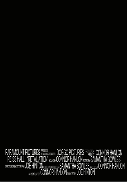
To make our film poster look authentic, we needed to put credits at the end. This proved particularly challenging as I had to create the format in small steps. I created the credits in Photoshop as this will be the software I will use to make the final product.
First I wrote out all the credits separately as it made it easier to move around and edit the size and position.

I then constructed the first line. I found that when the smaller writing was stacked for double lines, the larger writing wasn't alined. To over come this, I increased the size of the larger writing instead of decreasing the smaller writing as this would make it more difficult to read. At this point, I became concerned that the writing may be too big, but decided to finish the rest of the lines and edit it afterwards.

I then did the second line and found another issue. The format that I decided to do doesn't look professional as there are large gaps in between lines. In the final poster, I will pay more attention to the positioning on the smaller text.


In the end, this was the result. For a first try, I thought this was okay. For the next practice I will use the text tools to create a more authentic look, by making the text taller and thinner. This will mean I won't need to increase the text size. I will also find new ways of filling the gaps by doubling the lines more for the smaller text.


When saving the end practise, I saved the document as a 'psd' file. I found that if I saved a document as a 'jpeg' like I normally do, I lose all the layers so I can't edit the document as much as I would like to. By saving the document as a 'psd' file, all the layers are kept and are able to be edited.

First I wrote out all the credits separately as it made it easier to move around and edit the size and position.

I then constructed the first line. I found that when the smaller writing was stacked for double lines, the larger writing wasn't alined. To over come this, I increased the size of the larger writing instead of decreasing the smaller writing as this would make it more difficult to read. At this point, I became concerned that the writing may be too big, but decided to finish the rest of the lines and edit it afterwards.

I then did the second line and found another issue. The format that I decided to do doesn't look professional as there are large gaps in between lines. In the final poster, I will pay more attention to the positioning on the smaller text.


When saving the end practise, I saved the document as a 'psd' file. I found that if I saved a document as a 'jpeg' like I normally do, I lose all the layers so I can't edit the document as much as I would like to. By saving the document as a 'psd' file, all the layers are kept and are able to be edited.

Friday, 4 December 2015
Task 10: Audience Feedback on Print Products


Self Review of Print Products:
Poster 1:
- This idea is our preferred poster idea.
- Still need to get the photographs to edit for final product.
- Writing is too dark.
- Text font isn't appropriate.
- The blending of the mask into the head is effective.
- The blend is better than anticipated.
- There could be some issues with the facial proportions.
- Too simplistic.
- Taking the photographs could be difficult.
- All basic elements are included.
- Bold layout.
- Relevant information included.
- Images will need to be revised.
- Possibly need text across the two pages.
- repetition of "IN CINEMAS" is unnecessary.
- Colour scheme needs to be revised.
- Better text layout.
- Images still need to be revised.
- Added in new section ("Director's Interview").
- Better colour scheme.
- Could add in image of poster when completed.
- Added social media platforms.
- Layout of page is better/more professional.
- Which poster design do you prefer?
- Which review design do you prefer?
- Why did you choose these designs?
- What could still be improved on your chosen poster design?
- What could still be improved on your chosen review design?
- What images would fit best in the review?
- How could the re-positioning of elements improve the appearance of the film poster?
Please leave your answers as a comment on this blog post, Thank You.
Thursday, 3 December 2015
Task 10: Editing the Confrontation
Filming the fight scene was probably the most challenging part of the overall short film. This is because we needed to ensure that it was fast paced to create tension and emulate the emotions that would go through the character during a fight. One way we did this is by speeding up the clips slightly. This allowed for the impact to look more severe and added to the intensity of the scene. We had to make sure we only sped it up slightly because if the percentage was over 120% the footage started to look choppy. One way we could have overcome this was to film in 60 frames per second, however we were unsure whether the JVC camera had this ability. Fortunately, only a small percentage increase was required so the overall affect was successful in my opinion.


Wednesday, 2 December 2015
Task 10: Filming - Final Shots
 We filmed the final shots of the film but found lots of the clips too dark. I tried adding a luma corrector to try and solve this problem and it did to an extent, but added a grain to the footage. I will need to discuss with the group whether we will reshoot the shots but it is difficult as the area is one that has little light and we need to note the continuity with previous shots before adding artificial light. In terms of the content of the shots, we felt it was successful, particularly the attempt to emulate police lights shining on the protagonists face.

Tuesday, 1 December 2015
Task 10: Audience Feedback on First Draft
- The title music doesn't fade quick enough.
- There are issues with volume in some places.
- One of the cuts is delayed and needs editing.
- A few shots need to be reshot.
- When showing on the projector, lighting is an issue (this is fine on the Mac screen).
- Sound effects need to be added.
- Narrative may not be clear because ending still needs to be filmed.
- How does it fit the Thriller genre?
- What do you think is the narrative?
- What is your opinion on the colour correction?
- How does the soundtrack create a mood/atmosphere?
- What would be the audience for our short film in your opinion?
- Where would you expect our short film to be shown?
- What do you think of the pace of the film?
- What is your opinion of our aspect ratio of 16:9 to 2.39:1?
- What dialogue (if any) is needed to add to narrative?
- Can you suggest any issues with lighting?
Audience Feedback
Medal: Good range of shots
Effective use of sound
Mission: Make narrative more clear, perhaps have more speech
more shots of the antagonist
Medal: Good use of camera angles such as over the shoulder and establishing/ wide angled shots.
Mission: Include some extreme close ups to show the protagonist's facial expressions.
Have a clearer narrative. Level 3
Medal: Suspense built well
Follows thriller conventions
Mission: Adjust brightness/contrast in premiere.
More/clearer dialogue
Move away from horror themes
Medal: Good camera shots
Good use of lighting effect
Mission: make narrative more clear
more dialogue
Medal: Really good camera work and good location used
Mission: I thought the music didn't relate to what was going on. I was also unsure of the
genre. Level 3
Friday, 20 November 2015
Task 10: After Effects
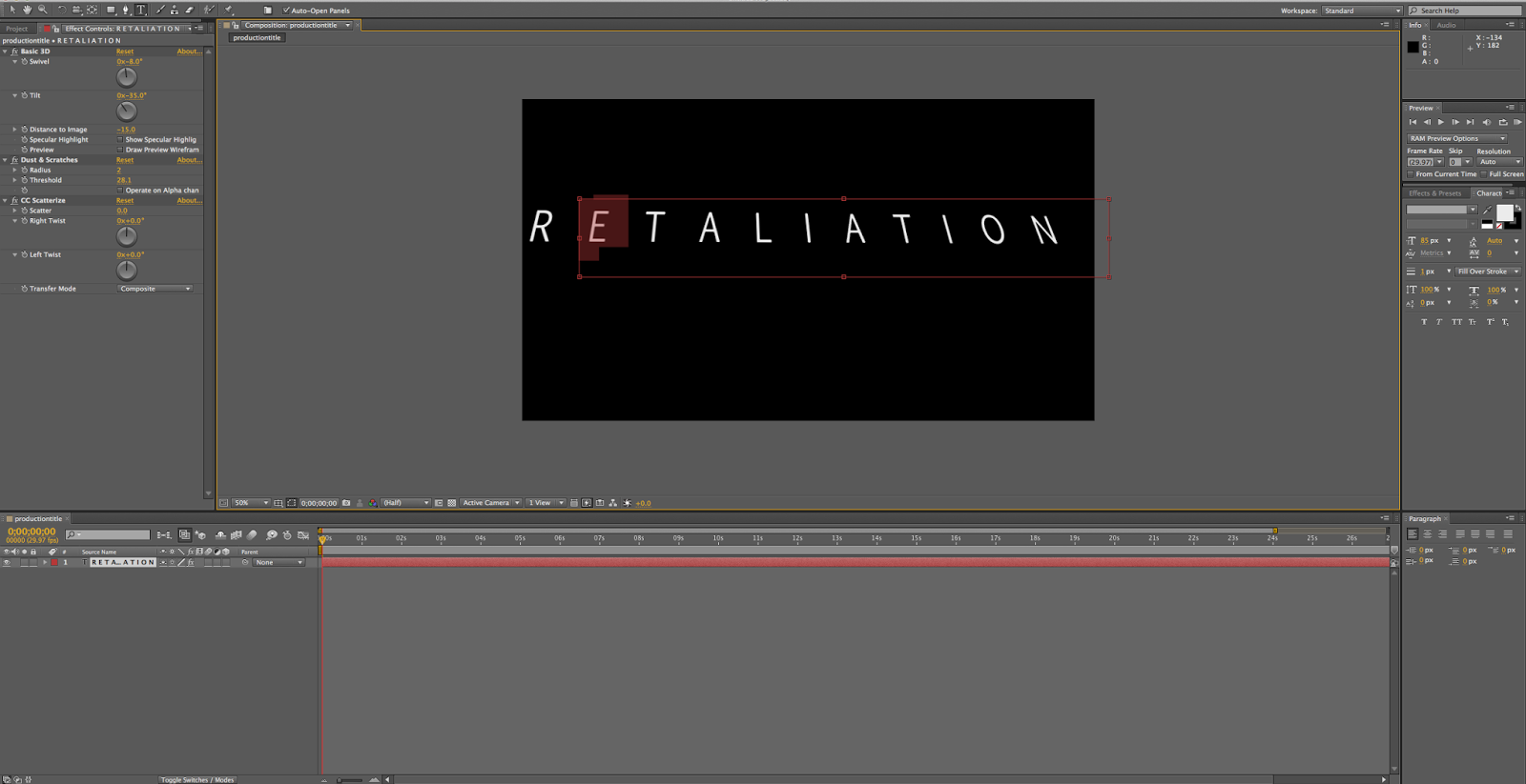
As films conventionally include the studios logos before the film, we decided to create our own. To do this we used After Effects, which is industry-standard in creating logos and compositions. Despite practicing with After Effects in AS, we found it difficult to understand and it took a while to get some ideas created. We decided to add an animated background with text that transitioned in, as we felt this was the most aesthetically pleasing. After exporting we decided to import it into Premiere, where we added a sound effect. When this was finalised we added it to the beginning of our short film.

Thursday, 19 November 2015
Task 10: Editing - Sound
As our production contained diegetic sound, we made sure that we used high quality equipment to record it. The JVC camera we used had an excellent microphone built in that was suitable.
However, even after this there was still unwanted audio in the shots, particularly the outside ones, such as the wind. There was no way I could have prevented this during the filming, however in Adobe Premiere I could add sound effects to remove the unwanted noise.
 I added a highpass filter to the outside shots so that the only sounds of a specific decibel reading can pass through. This meant that the sounds of the door opening was picked up but the wind in the background was not. As well as being more satisfying to listen too, it also helped each shot to flow, as the sound was consistent throughout, meaning that hopefully the continuous editing is unnoticeable.
We decided to overlap the audio slightly with the jump cut to emphasize the sudden change and to create tension. This was very subtle but we thought it looked a lot better than it did previously and helped the shots flow despite the jump.
After this I added soundtracks. Initially after adding the first soundtrack I felt that the ending was too abrupt. I tried to fade it out but it wasn't successful, so I decided to add an more ambient soundtrack to the end of it so that they overlapped seamlessly, and this also helped to build tension in the subsequent scene that showed the protagonist trying to find out what was outside.
Once we filmed the later parts of the film, I noticed for many of the scenes the sound was left ear only. This made it unpleasant to listen to so I decided to try and fix this in Premiere. I found out that there was an audio effect called 'fill left' which meant that the audio from the left ear was replicated on the right side. We applied this to all of the scenes.
However, even after this there was still unwanted audio in the shots, particularly the outside ones, such as the wind. There was no way I could have prevented this during the filming, however in Adobe Premiere I could add sound effects to remove the unwanted noise.
We decided to overlap the audio slightly with the jump cut to emphasize the sudden change and to create tension. This was very subtle but we thought it looked a lot better than it did previously and helped the shots flow despite the jump.
After this I added soundtracks. Initially after adding the first soundtrack I felt that the ending was too abrupt. I tried to fade it out but it wasn't successful, so I decided to add an more ambient soundtrack to the end of it so that they overlapped seamlessly, and this also helped to build tension in the subsequent scene that showed the protagonist trying to find out what was outside.
Once we filmed the later parts of the film, I noticed for many of the scenes the sound was left ear only. This made it unpleasant to listen to so I decided to try and fix this in Premiere. I found out that there was an audio effect called 'fill left' which meant that the audio from the left ear was replicated on the right side. We applied this to all of the scenes.
Wednesday, 18 November 2015
Task 10: Editing - Colour Correction
As our film is a thriller, we felt that it's darker themes meant that the colours would have to suit it. We decided to reduce the intensity of the colour, as we wanted to emphasize the protagonist's emotions of both isolation and fear. We did this by adding... We also decided to increase the contrast, as we wanted the shadows to be more harsh to unnerve the viewer.
Our film was filmed with a 16:9 aspect ratio, however after further research into the thriller genre, we found out that the conventional aspect ratio was an anamorphic 2.39:1. Therefore we decided to change it in post production.There is not a concrete method of changing aspect ratios in Premiere, but it can be done a variety of different ways. One method we looked at is cropping the video 12.5% on the top and bottom. Although this is easy to do and works effectively, it prevented us from framing the shot afterwards, and the head of the subject was often cut off. We decided to try a different method, which was to add two separate black colour matte's on the above video layers, This meant that the below layers weren't affected and, as a result, we could re-position the shot so that it contained the subject. Also, as this was in a separate layer, it could be dragged across the duration of the film, so it did not have to be repeated for each shot, which would have been the case for cropping.

Our film was filmed with a 16:9 aspect ratio, however after further research into the thriller genre, we found out that the conventional aspect ratio was an anamorphic 2.39:1. Therefore we decided to change it in post production.There is not a concrete method of changing aspect ratios in Premiere, but it can be done a variety of different ways. One method we looked at is cropping the video 12.5% on the top and bottom. Although this is easy to do and works effectively, it prevented us from framing the shot afterwards, and the head of the subject was often cut off. We decided to try a different method, which was to add two separate black colour matte's on the above video layers, This meant that the below layers weren't affected and, as a result, we could re-position the shot so that it contained the subject. Also, as this was in a separate layer, it could be dragged across the duration of the film, so it did not have to be repeated for each shot, which would have been the case for cropping.
Tuesday, 17 November 2015
Task 10: Editing - Cutting
We began by importing all of the clips into premiere pro and placed the clips we intended to use onto the timeline in chronological order. There was a lot of clips that were considered unusable, but some shots had multiple successes and therefore we had to choose the best one. We picked favourites and decided to keep the backups for later on in the editing stage when sound is added so that we can see which shot fits better. We then watched the clips through and used the razor tool to cut them appropriately. We had a couple of match on action shots that we needed to cut specifically to show that both shots are continuous and flow. There was one jump cut in our film and we wanted to emphasize this by slightly overlapping the sound, which is loud and keeps the viewer on edge.


Thursday, 5 November 2015
November feedback
Your web-log needs some attention as the last posts was 8th October. Dkeep up the regular posts and esnure all reserach and planning is now published.
Your short film has a clear progression of shots and the bars are effective in giving it a cinematic look. Shots are of a good quality and framing and composition are proficient showing excellent technical skill in use of the camera. Audio has been considered and a JVC camera has been used which shows ambition and an ability to use a more advanced camera.
Music is appropriate and builds tension ass does the length of shots. Feedback may indicate that shots are lengthy but this suits the style of the short film.
Music is copyright free as it is sourced from Incomputech so make this clear in your web-log or put it in the credits.
Document your creative journey
I don't think you need to overdub sound but maybe add some ambient sounds or effects.
The narrative is clear. Make sure that the story is not cliched. Be original and think of a twist at the end or defy expectations. I am intrigued as to how you will resolve the narrative. this is the key to level 4.
Your short film has a clear progression of shots and the bars are effective in giving it a cinematic look. Shots are of a good quality and framing and composition are proficient showing excellent technical skill in use of the camera. Audio has been considered and a JVC camera has been used which shows ambition and an ability to use a more advanced camera.
Music is appropriate and builds tension ass does the length of shots. Feedback may indicate that shots are lengthy but this suits the style of the short film.
Music is copyright free as it is sourced from Incomputech so make this clear in your web-log or put it in the credits.
Document your creative journey
I don't think you need to overdub sound but maybe add some ambient sounds or effects.
The narrative is clear. Make sure that the story is not cliched. Be original and think of a twist at the end or defy expectations. I am intrigued as to how you will resolve the narrative. this is the key to level 4.
Tuesday, 27 October 2015
Task 10: Filming Day 2
For the second day of filming, we had to re-shoot the shots that were unusable on day 1. We started filming much earlier, which gave us much more time to prepare and ultimately film the scenes. This day was successful and we got a large portion of the filming done, however it began to rain and so we decided to stop shooting so that no equipment was damaged and also for continuity, as the rain would not have appeared earlier on in the film.
Thursday, 22 October 2015
Task 10: Filming Day 1
We began filming using the JVC Camera. We used this because it had good automatic settings that would stay consistent from shot to shot, which is important for continuity. With continuity in mind, we noticed that the ovens had a time on them, and that it would change between shots. Fortunately, none of the shots in the storyboard required them to be in camera, and this problem did not trouble us.
We decided to film near to sunset, as this had the most visually appealing lighting and helped to set the tone for the film, however an issue we had is that we began filming too late and so we only got to shot 8 before it started to get darker. We tried to avoid it being dark as it can cause lots of reflections, particularly as the set had lots of windows, and also we did not test how well the camera performs in low lighting conditions.
This was the only issue we had with filming and everything else went as planned, so we are going to shoot again next week, after checking what footage is usable and what we need to re-shoot. We are going to start filming a lot earlier this time, so we have plenty of time to get the footage recorded.


We decided to film near to sunset, as this had the most visually appealing lighting and helped to set the tone for the film, however an issue we had is that we began filming too late and so we only got to shot 8 before it started to get darker. We tried to avoid it being dark as it can cause lots of reflections, particularly as the set had lots of windows, and also we did not test how well the camera performs in low lighting conditions.
This was the only issue we had with filming and everything else went as planned, so we are going to shoot again next week, after checking what footage is usable and what we need to re-shoot. We are going to start filming a lot earlier this time, so we have plenty of time to get the footage recorded.
Friday, 25 September 2015
Pitch Feedback
Your pitch was presented effectively using
slides to outline ideas. You communicate well as a team and seem to have
developed roles within the group.
I like the idea of an interrogation and it
offers opportunities to explore lighting and mise en scene in a short scene.
One concern was how this would be a short film
as it reflects the tropes of dram on TV. However, you explained how this
would be overcome effectively. Ideas
such as use of colour sound interesting, make these clear. Your answers revealed a depth of thought
about the narrative which allayed any fears about the genre and medium.
Be realistic about where you film this. It
is ambitious to use the library and keep e-mail communication to show
planning.
Why use a Go Pro? Explain what different cameras bring to the
style of the piece.
Can you publish a first draft of the script
on the blog?
Comment on audience feedback received as part
of the pitch. You will need this later for the evaluation.
Outline the roles allocated within the
group.
Wednesday, 23 September 2015
Task 10: Recce
Below is a series of photographs taken prior to filming to get an idea of the location and to identify risks for the risk assessment. They also gave us a greater understanding of how we were going to frame our shots.


Thursday, 17 September 2015
Task 10:Production Schedule
Monday, 28 September 2015
Production Schedule
DATE
|
TIME
|
SCENE
|
CHARACTER
|
DETAILS
|
LOCATION
|
02/10/2015
|
18:00
|
NONE
|
NONE
|
Set-Up
|
Protagonist’s house
|
18:30
|
Radio
|
NONE
|
-
|
Kitchen
|
|
19:00
|
Phone Call
|
Alton Keller (Reiss Hall)
Vance (voice of
|
-
|
Kitchen
|
|
19:30
|
Drink
|
Alton Keller (Reiss Hall)
|
Close-ups and Establishing shots.
|
Kitchen to Dining room
|
|
20:00
|
Change in events
|
Alton Keller (Reiss Hall)
|
Triggered by outside stimulus
|
Outside/Garden
|
|
003/10/2015
|
18:00
|
NONE
|
NONE
|
Set-Up
|
Protagonist’s house
|
18:30
|
Character Trauma
|
Alton Keller (Reiss Hall)
|
Canted angles/Fast cuts
|
Dining room
|
|
19:00
|
Character goes upstairs
|
Alton Keller (Reiss Hall)
Killer (Josh Wilcox)
|
-
|
Stairway
|
|
19:30
|
Confrontation
|
Alton Keller (Reiss Hall)
Killer (Josh Wilcox)
|
-
|
Second floor
|
|
20:00
|
Police Phone Call
|
Alton Keller (Reiss Hall)
Killer (Josh Wilcox)
|
-
|
Room on second floor
|
|
20:30
|
Ending
|
Alton Keller (Reiss Hall)
Killer (Josh Wilcox)
|
-
|
Second floor
|
Subscribe to:
Posts (Atom)