Thursday, 18 February 2016

Video production feedback

Excellence is demonstrated in the creative use of a range of technical skills.

An institutional logo is created using After Effects with a signature tune to accompany a professional looking opening.  Use of cinematic bars and colour correction allow the product to look like a short film for cinematic exhibition.  Audio levels and mixing is accurate at most points and audio elements provide a lot of the meaning.  The audio is key to understanding the narrative and some of the shots. These clues are not always clear and along with some lighting issues and some shots being short in length, prevent the highest marks being awarded. However technical skill is excellent throughout with seamless editing and clear continuity due to effective planning and editing.  Music is appropriate and well sourced being copyright free.  It adds tension and creates an atmosphere.  There are a range of shots and use of the camera is controlled.  The narrative is coherent and follows the conventions of a short film ending on a twist as the character realises he has been set up. Credits reach near professional standards creating a professional looking short film.  35/40

Wednesday, 10 February 2016

Task 13: Evaluation Question 3 (What have you learned from audience feedback?)

Audience feedback was very vital in the creating of our media product, thought pre and postproduction; even during production feedback was very useful. An example of feedback pre production was drafting various ideas to see which people liked more. The audience feedback was very important during post-production in this project.  As a lot of the content was added in after the first cut, which was still missing some takes and some sound effects and voice-overs.
The first feedback we got during this production was when we showcased a few ideas to our class to see which they liked more, this was very basic and before we had much information about the ideas, just how they sounded. We then pitched our idea to a larger audience of our class, to see their opinion on it. We had rough outlines of what we were doing, which it was supposed to be Crime/Thriller/Detective short film, which from the feedback we gathered the idea would not work as well as it could, in the form of a short film.
As a result of this, we decided to change our idea with something we believed would be much more fitting in the form of a short film, which was purely a Thriller short film, which people liked the premise of the basic ideas. This was a more practical idea that would fit much easier within the timescale of five minutes, which we were limited to. One of the more difficult tasks we faced in preproduction was creating an understandable narrative within the timescale, as we did not have much time to develop characters. We used audience feedback to work on a narrative that was understandable but still somewhat challenging, leaving the audience to uncover the narrative on their own.
After the production of our first draft, which was unfinished as it was missing some footage we had yet to film, we exhibited this draft to the class. We then asked for general feedback, rather than feedback on targeted issues, which we did for later drafts. The main feedback we got from our first draft was about the narrative. Members the audience found the narrative unclear and confusing, which was not ideal, as this was one of our largest concerns. We thought that we would act upon the feedback and work to create a stronger narrative. Which we were able to do in the remaining shots, which we added more shots and sounds to indicate that the protagonist was in danger. Such as an expansion of the planned fight scene, which was yet to be filmed. We decided to change the outcome of the fight scene to make it longer, to add more conflict into the narrative. As well as this, we added some sounds, such as the noise the protagonist hears from the outside.
After building on our first draft, we did the same with our secondary draft, which was the final draft before the short film was complete. This time we asked for feedback targeted on our narrative, sound (predominantly music choices) and pacing of it all. The feedback went well, the positive feedback we got about the music was that it fit very well and built atmosphere, and it matched the pacing very well. However, there was concern over the narrative. Mostly in the beginning, as people could not understand what the phone call conversation was about. We decided to use this feedback my adding in some dialogue we cut from the script early on in pre-production. We added it in using a voice recorder, and fitted it into the gaps that we left in the opening dialogue. Our audience found this helpful to explain the flow of the narrative.

Overall, audience feedback was very important in guiding us in creating a media product suitable for our target audience, as thrillers are a very narrative driven genre, and through feedback we revolved this issue effectively. As well as this, positive feedback was useful in letting us know what didn't need to be changed, and letting us know that what we were doing was going in the right direction. 

Tuesday, 9 February 2016

Task 13: Evaluation Question 4 (How did you use media technologies in the construction and research, planning and evaluation stages?)


Research and Planning
We used a variety of tools to assist in our research and planning. the browser we used was Firefox, as it allowed us to access some websites we needed to use for research which on the other browsers we had access to were filtered, and would hinder our production. With it, we accessed websites we see examples of short films. Websites such as Vimeo on YouTube were very useful for this. We looked at a wide range of short films to get a grasp on the structure of them, and to build up the knowledge on what to include in our own. An example of this one that we found on YouTube called “The Hedgehog”.  Whereas the film was a completely different genre, we were able to see how it fit a full narrative in under ten minutes.
To research what our target audience would be we used the YouGov.co.uk. On this website it uses government data to find statistics on what groups of people like or do, such as where they prefer to shop, how much they make and what films they enjoy. This was useful, as we used it to find the general audiences that enjoyed films similar to ours, to help find our target audience. However all these films we looked at had totally different audiences according to the website. We decided that since we could not find a solid group of so we could just label our target audience as Thriller fans.
We had to pitch our short film idea to an audience. To format it we used Microsoft PowerPoint. The software allowed us to format different aspects of our idea, such as narrative and character into different slides. We chose to use this over other tools to present this was due to it’s simplicity and how easy it would be to change, if we had any new ideas shortly before presenting the pitch. Where as tools such as Prezi are more visually engaging, we felt the simplicity of PowerPoint made more time for us to create ideas.
To store all our research, making it accessible at anytime, we used Blogger.com to upload our planning, such as scripts, storyboards ad general research on short films and print productions. Blogger is very useful as you can embed videos and images into the html code letting you show something you are referencing such as a part of a scene or a soundtrack that inspired your idea. This give anyone reading it reference to what you are discussing in the planning. Blogger is more useful than just using hard copies of research and planning as keeping it digitally not only makes it more accessible and secure but presents in a tidy and readable manner

Production and Post Production
We filmed our footage using the JVC 3CCD Pro HD Camera. We chose this over the over the Sony Handicam as it has full manual settings, and this was essential as some of the locations we filmed at had harsh lighting which we had to configure the camera for before shooting. Another benefit of using the JVC was that it had manual focus, and this allowed us to achieve the shallow depth of field in the shot where the protagonist is sitting at his table. The Sony Handycam would have allowed us to film in HD, but had full automatic settings and this would have limited us.

We used a Camlink tripod to stabilise the camera for most shots as to not disorient the viewer. However this was not necessary for the certain shots, which were done handheld for the purpose of building tension.

For the final shot when the police arrived, we used artificial lighting to suggest that they are outside the protagonists home. This was done with a phone application that was behind the camera so that it reflected into the scene. We wanted it to end with only seeing the light of the police as this adds to the mystery of the cut-to-black ending.

We decided to use Adobe Premiere to edit our short film, as it is industry standard editing software. What is great about Premiere is that it allowed us to colour correct our footage within the sequence and we could then add the same preset to other shots. We could also edit and add sound easily within the sequence.

Our music was sourced from Incompetech.com. Incompetech has a large library of royalty free music, which meant that we could find the right soundtracks to fit with the narrative and emotion of specific scenes in the short film. Also, being royalty free means that there was no copyright issues with using the music as long as we gave credit to who created it and the website it came from, which we did at the end of the film in the credits.
To create the production logo in post production we used Adobe After Effects. Like Premiere, this is also industry standard and gave us a lot of options as to what the logo was going to look like. We could then export it as a .mov file to be imported into Adobe Premiere without any issues. We found After Effects to be the most challenging software to use as it was unlike any other software we had used in the past and it had a steep learning curve. Therefore, we used YouTube to look at tutorials on the basic effects to use. Should we have had more time, we would have likely spent more time in After Effects to find more complex effects that would have made our logos look better and more professional.
To obtain sound effects we used freesound.org, which had a library of free sounds which could be downloaded. We used this to add sounds that we were unable to during filming, such as the sound outside when the protagonist is at his table inside.


Print Products and Evaluation
To create our print products, we used Photoshop for both the poster and the two page magazine spread.To create the main image of the poster, we took photographs of the main actor and a mask using a Nikon D3100 DSLR and a green screen. This made the editing process easier as the green stood out and could be taken away from the images we needed.Then, to create the wanted look of having the mask blend into the actor’s face, we changed the opacity of the mask. However, we found the edge of the mask was still obvious against the actor’s face. To correct this, we added a dark gradient to the bottom of the entire image. Because this made the image too dark, we had to adjust the brightness to that the image would be seen clearly when printed. Then we blended the edges with the blur tool to soften the mask against the actor’s face. We tried to feather the edge with the edge define settings, but this didn’t give the desired effect.We also then made the credits for the bottom of the poster. This took a long time to do because we had to use multiple layers for each name and phrase. Then, we had to arrange the credits so that they were central.The use of the colour blue was important in our poster as it linked our print products to our production. We first created the main title of the poster in after effects, creating a blue smoke around the text, then used to same blue to accent the important information on the poster (the release date and the actor’s names). We also tinted the main image of the poster in the same colour used in the production to create continuity between the production and the poster.Creating the review was a little easier than creating the poster, but it still had its challenges as we used Photoshop in a different way. Instead of using various effects to create a main image, we instead had to shape text, frame images and create bold titles.To create the various titles, we used different techniques within Photoshop. The more simplistic titles “Director’s Interview” and “Retaliation” were simply created with the text tool in Photoshop. We used a similar colour scheme to the colour schemes used in magazines, such as ‘Empire’. To create the “In Cinemas” title, we had to use the text tool and the shape tool. First we created a separate canvas and added the basic text, using the Times New Roman font. We then changed the colour on the text to two shades of blue so that the text would stand out from the rest of the article. It became tricky to create the white line within the bold text as we had to use the shape tool. We decided to create the text like this because it is used on all the film reviews we analysed. Using the shape tool, we traced the shape of each letter with a white line, make short squares through the letter.We then added in the main body text. We first wrote the review in a Word document then pasted it onto the main canvas. We had to do this in sections so that all the text would fit into the place where we wanted it to be. We had to leave space for images so that the review would be aesthetically pleasing and so that the text would be broken up.
We then filled in the gaps using the shape tool. The first shape we placed was the “Out Now” circle. We placed this in the space where we thought would be best and hen shaped the text around the circle using the move tool. We then filled in the rest of the gaps with bold line which linked to the layout of the “Empire Magazine” articles we originally looked at.


Sunday, 3 January 2016

Task 11: Film Review Practice 1

To do a draft of the two page spread film review, I worked in Photoshop. I set the canvas at 50cm (width) and 30cm (height) as a rough guideline of the shape the final print product will be. The black line in the middle of the canvas is to indicate the split between the two pages.
I then took a screen grab from the first edit and made it larger so it covered the majority of the second page. After doing research into film reviews in well-known magazines, such as Empire, I found that there was little blank space on either page, with one page almost completely covered in an image or several images.
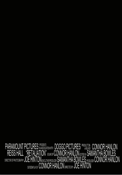
Finding a font was difficult as it needed to look realistic. I looked at Empire film reviews to compare what fonts are used for the titles. The closest I could find on Photoshop was Ariel Black as, even though it is simple, it is clear and bold. I also noticed that the text that overlaps images blend into the white background as there is a white border around the text. To do this, I simply placed the text over a white rectangle which I created by using the rectangle tool.


I then wanted to add in some sort of rating. To do this, I searched for how Empire do their star ratings and found an image of their single star symbol. I experimented with adding a white border around the four stars, similar to the title, but it didn't work in the same way.
Looking at various reviews, There are different colour schemes and black text is only used for the main body of the review. This makes the review more aesthetically appealing to the reader. I changed the colour scheme to a deep red as darker colours are more commonly used.
After further research, I found that almost all film reviews for new films have 'In Cinemas' in the top corner of the page. I decided to put this in the bottom corner because of the layout I had already made. On our final draft of the review, I will put this in the top left corner.

Another way that reviews in magazines fill up the space on the page is to add shapes and lines. In  Empire reviews, it is common to see thick black lines to fill blank space. This is what I did on this practice and I experimented with the positioning.
I then added another screenshot. For the final product, we may add in an extra image and make them brighter so that they are clearer. However, I think that the darkness of the images goes well with the genre as it is a thriller and the film is dark in places.
I wanted to add something to the article to state when the film will be released and to do this, I created a bold yellow circle with the release year stated. After formatting the writing, I saw that there was a space which needs to be filled. I think it might be a possibility that the star rating could be placed in the circle instead of to the side.
This is a possible layout to how the two page review may look. For the final product, some elements may be moved around, as stated above. Depending on the amount of text in the main body and the size of the text, I may put in extra images, experimenting with cropping and different shapes so that the page is interesting to look at. Another idea that could be on the final product is the use of social media links, such as Twitter, Facebook and Instagram. There will also be a thin border around the content so that it looks more realistic.

Saturday, 2 January 2016

Task 11: Film Review Practice 2

For my second magazine review practice, I took inspiration from the "Ted" review in Empire Magazine. I included various different elements to create a different layout so that there is more to look at, along with keeping the relevant information in a smaller space.

I started with the same aspect ratio as the previous practice, but this time, I saved a border around the images and article. This gave me room to add in more information and made it look more realistic.
I then selected three stills from the film that we had shot so far. At this point, I was still limited on the images I could use but I feel the arrangement has improved since the first practice. By adding more images, the reader can see whether or not they want to read the article by the screenshots provided. For the final print product, I will be careful to chose high quality images and possible use the final film poster to promote the film.
Next I added the headings. At first, I used a black font but found that it didn't stand out enough on the image. Unlike the first film poster and the first review, I used a bright orange font instead of a deep red. This would make the article look more inviting and vibrant, drawing in readers that may not have looked at the article if the font was dark.
Like in the first practice, I used bold black lines to break up the page. These lines separate the main body of the review from the 'Director's Interview' and provide a space for any extra information.
This extra information was to include social media links. The thick line at the bottom of the page is where I put the different logos for three main social media platforms; Instagram, Facebook and Twitter. The thick gap at the bottom of the page is where the page number and the website would. This was clear on the "Ted" review so I included this in this practice.

Friday, 1 January 2016

Task 11: Film Poster Credit Practise

To make our film poster look authentic, we needed to put credits at the end. This proved particularly challenging as I had to create the format in small steps. I created the credits in Photoshop as this will be the software I will use to make the final product.

First I wrote out all the credits separately as it made it easier to move around and edit the size and position.

I then constructed the first line. I found that when the smaller writing was stacked for double lines, the larger writing wasn't alined. To over come this, I increased the size of the larger writing instead of decreasing the smaller writing as this would make it more difficult to read. At this point, I became concerned that the writing may be too big, but decided to finish the rest of the lines and edit it afterwards.


I then did the second line and found another issue. The format that I decided to do doesn't look professional as there are large gaps in between lines. In the final poster, I will pay more attention to the positioning on the smaller text.


In the end, this was the result. For a first try, I thought this was okay. For the next practice I will use the text tools to create a more authentic look, by making the text taller and thinner. This will mean I won't need to increase the text size. I will also find new ways of filling the gaps by doubling the lines more for the smaller text.


When saving the end practise, I saved the document as a 'psd' file. I found that if I saved a document as a 'jpeg' like I normally do, I lose all the layers so I can't edit the document as much as I would like to. By saving the document as a 'psd' file, all the layers are kept and are able to be edited.