Tuesday, 19 January 2016
Sunday, 3 January 2016
Task 11: Film Review Practice 1
To do a draft of the two page spread film review, I worked in Photoshop. I set the canvas at 50cm (width) and 30cm (height) as a rough guideline of the shape the final print product will be. The black line in the middle of the canvas is to indicate the split between the two pages.
 I then took a screen grab from the first edit and made it larger so it covered the majority of the second page. After doing research into film reviews in well-known magazines, such as Empire, I found that there was little blank space on either page, with one page almost completely covered in an image or several images.
 Finding a font was difficult as it needed to look realistic. I looked at Empire film reviews to compare what fonts are used for the titles. The closest I could find on Photoshop was Ariel Black as, even though it is simple, it is clear and bold. I also noticed that the text that overlaps images blend into the white background as there is a white border around the text. To do this, I simply placed the text over a white rectangle which I created by using the rectangle tool.


 I then wanted to add in some sort of rating. To do this, I searched for how Empire do their star ratings and found an image of their single star symbol. I experimented with adding a white border around the four stars, similar to the title, but it didn't work in the same way.
 Looking at various reviews, There are different colour schemes and black text is only used for the main body of the review. This makes the review more aesthetically appealing to the reader. I changed the colour scheme to a deep red as darker colours are more commonly used.
 After further research, I found that almost all film reviews for new films have 'In Cinemas' in the top corner of the page. I decided to put this in the bottom corner because of the layout I had already made. On our final draft of the review, I will put this in the top left corner.

Another way that reviews in magazines fill up the space on the page is to add shapes and lines. In Empire reviews, it is common to see thick black lines to fill blank space. This is what I did on this practice and I experimented with the positioning.
 I then added another screenshot. For the final product, we may add in an extra image and make them brighter so that they are clearer. However, I think that the darkness of the images goes well with the genre as it is a thriller and the film is dark in places.
 I wanted to add something to the article to state when the film will be released and to do this, I created a bold yellow circle with the release year stated. After formatting the writing, I saw that there was a space which needs to be filled. I think it might be a possibility that the star rating could be placed in the circle instead of to the side.
 This is a possible layout to how the two page review may look. For the final product, some elements may be moved around, as stated above. Depending on the amount of text in the main body and the size of the text, I may put in extra images, experimenting with cropping and different shapes so that the page is interesting to look at. Another idea that could be on the final product is the use of social media links, such as Twitter, Facebook and Instagram. There will also be a thin border around the content so that it looks more realistic.


Another way that reviews in magazines fill up the space on the page is to add shapes and lines. In Empire reviews, it is common to see thick black lines to fill blank space. This is what I did on this practice and I experimented with the positioning.


Saturday, 2 January 2016
Task 11: Film Review Practice 2
For my second magazine review practice, I took inspiration from the "Ted" review in Empire Magazine. I included various different elements to create a different layout so that there is more to look at, along with keeping the relevant information in a smaller space.
I started with the same aspect ratio as the previous practice, but this time, I saved a border around the images and article. This gave me room to add in more information and made it look more realistic.
 I then selected three stills from the film that we had shot so far. At this point, I was still limited on the images I could use but I feel the arrangement has improved since the first practice. By adding more images, the reader can see whether or not they want to read the article by the screenshots provided. For the final print product, I will be careful to chose high quality images and possible use the final film poster to promote the film.
 Next I added the headings. At first, I used a black font but found that it didn't stand out enough on the image. Unlike the first film poster and the first review, I used a bright orange font instead of a deep red. This would make the article look more inviting and vibrant, drawing in readers that may not have looked at the article if the font was dark.
 Like in the first practice, I used bold black lines to break up the page. These lines separate the main body of the review from the 'Director's Interview' and provide a space for any extra information.
 This extra information was to include social media links. The thick line at the bottom of the page is where I put the different logos for three main social media platforms; Instagram, Facebook and Twitter. The thick gap at the bottom of the page is where the page number and the website would. This was clear on the "Ted" review so I included this in this practice.

I started with the same aspect ratio as the previous practice, but this time, I saved a border around the images and article. This gave me room to add in more information and made it look more realistic.


Friday, 1 January 2016
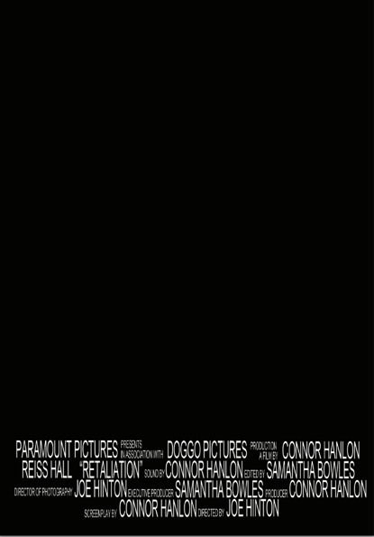
Task 11: Film Poster Credit Practise
To make our film poster look authentic, we needed to put credits at the end. This proved particularly challenging as I had to create the format in small steps. I created the credits in Photoshop as this will be the software I will use to make the final product.
First I wrote out all the credits separately as it made it easier to move around and edit the size and position.

I then constructed the first line. I found that when the smaller writing was stacked for double lines, the larger writing wasn't alined. To over come this, I increased the size of the larger writing instead of decreasing the smaller writing as this would make it more difficult to read. At this point, I became concerned that the writing may be too big, but decided to finish the rest of the lines and edit it afterwards.

I then did the second line and found another issue. The format that I decided to do doesn't look professional as there are large gaps in between lines. In the final poster, I will pay more attention to the positioning on the smaller text.


In the end, this was the result. For a first try, I thought this was okay. For the next practice I will use the text tools to create a more authentic look, by making the text taller and thinner. This will mean I won't need to increase the text size. I will also find new ways of filling the gaps by doubling the lines more for the smaller text.


When saving the end practise, I saved the document as a 'psd' file. I found that if I saved a document as a 'jpeg' like I normally do, I lose all the layers so I can't edit the document as much as I would like to. By saving the document as a 'psd' file, all the layers are kept and are able to be edited.

First I wrote out all the credits separately as it made it easier to move around and edit the size and position.

I then constructed the first line. I found that when the smaller writing was stacked for double lines, the larger writing wasn't alined. To over come this, I increased the size of the larger writing instead of decreasing the smaller writing as this would make it more difficult to read. At this point, I became concerned that the writing may be too big, but decided to finish the rest of the lines and edit it afterwards.

I then did the second line and found another issue. The format that I decided to do doesn't look professional as there are large gaps in between lines. In the final poster, I will pay more attention to the positioning on the smaller text.


When saving the end practise, I saved the document as a 'psd' file. I found that if I saved a document as a 'jpeg' like I normally do, I lose all the layers so I can't edit the document as much as I would like to. By saving the document as a 'psd' file, all the layers are kept and are able to be edited.
Subscribe to:
Comments (Atom)